Hard-to-read bus schedule changes draw complaints in Taipei
Hard-to-read bus schedule changes draw complaints in Taipei
2024-05-01
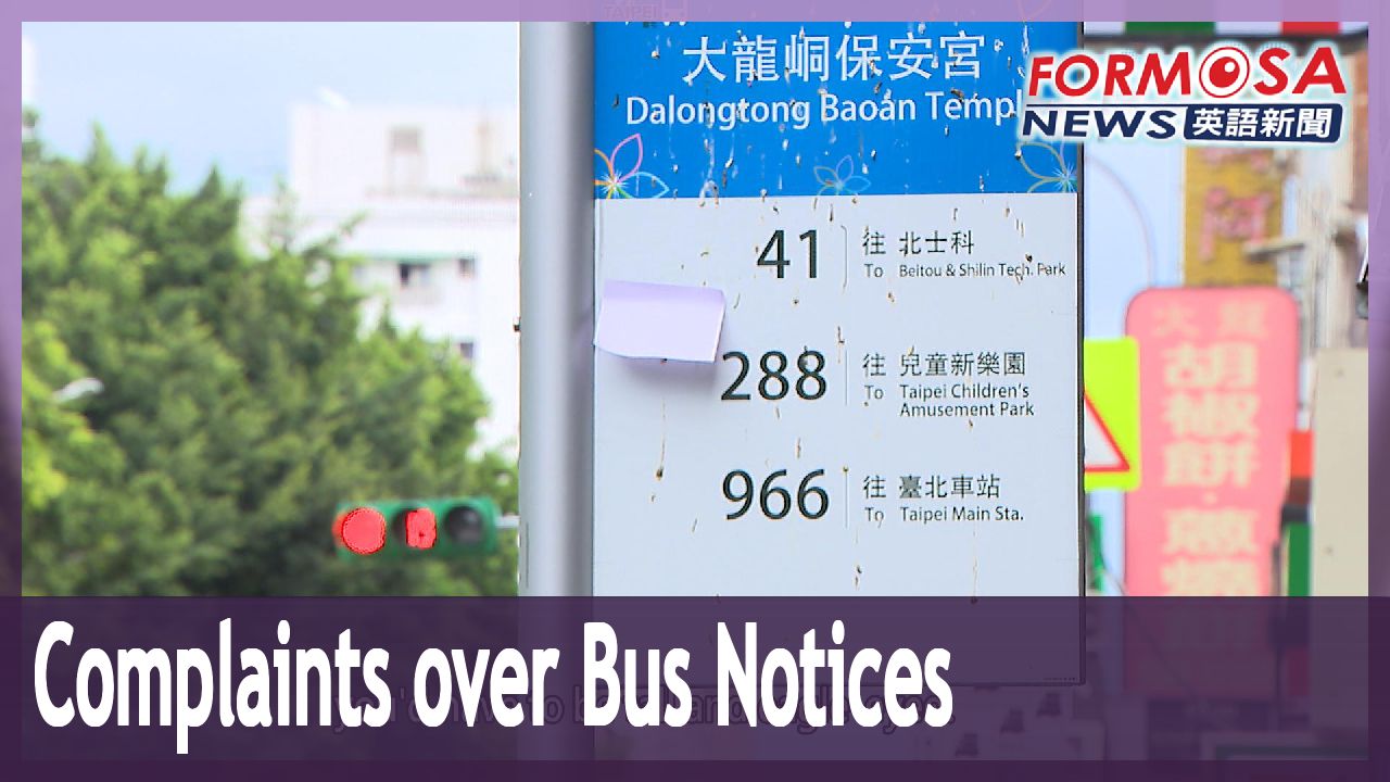
Bus schedule changes are a fact of life in Taipei, where more than 390 million bus trips are taken each year. But the way these changes are announced has left some commuters frustrated. Schedule updates are often made in tiny print on small notices, which are stuck high up on bus stop posts. One local councilor criticizes the approach, saying you shouldn’t need to be tall or strain your eyes just to catch a bus.
Taipei City has a dense bus network, and navigating it can be daunting. Riders say that one big hurdle is the tiny notices that go up when there are changes to bus schedules and frequency.
A small note crammed with text is taped to the bus stop sign. It’s stuck so high up that it’s barely noticeable.
Member of public
If you’re young you might be able to read it. But I can’t.
Member of public
The print is too small. It’s not clear at all. And who would look up? You don’t know what it is and you’d just assume it’s an ad.
Chen Jou-an
FTV reporter
We’re here at a bus stop to create a scenario. The notice is up on the stop sign. If you look up from below, you wouldn’t be able to make it out properly. Want to pull the paper down for a closer look? I’m stretching my arm out, but it’s too high out of reach.
To keep up with the latest schedule changes, you’d have to be tall and eagle-eyed. A councilor says these notices test the limits of human faculties.
Chen Yi-chun
Taipei City councilor (DPP)
Visitors from outside Taipei say the font is too small and the note too far up. They wonder, “Is it because Taipei people are tall?” “Is their eyesight that good?” The notices should take ergonomics into account. Taking the bus shouldn’t depend on passing a physical test.
Voice of Ho Yu-ting
Taipei City Public Transportation Office official
Perhaps the placement of the notice isn’t appropriate. We will ask operators to review this issue.
Current regulations require that notices be placed at the lower edge of bus signs, or on the announcement board of bus shelters. The city’s transport office says it will conduct public information campaigns about the notices, and ask operators to use larger fonts so that the updates are easier to read.
For more Taiwan news, tune in:
Sun to Fri at 9:30 pm on Channel 152
Tue to Sat at 1 am on Channel 53
公車調整公告貼"高處" 議員調侃:字體又小 像挑戰人體極限
2024-05-01
台北市的公車,光是去年一整年載客人次就高達3.9億,不過,對不少人來說複雜的路線和班次,相當頭痛,現在又有民眾抱怨,公車班次、時間異動調整的公告,貼在高處,字體也小到看不清楚,議員就調侃視力好、身高夠高才能看到,市民搭公車,就像在挑戰人體極限。
台北市公車路線多到爆,光是該搭哪輛車、通往什麼方向,對不少人來說,都像一場考驗,現在又有民眾發現"公車調整班次和時間的公告",根本是整人遊戲。
一張便條紙大小,上面擠著密密麻麻的時間,就隨意貼在站牌上頭,這張更扯,貼這麼高,光是要注意到都有困難。
[[民眾]]
“年輕人就看得到,像我就看不到”
[[民眾]]
“這字太小了,而且不清楚啊,誰會一直這樣看,根本就不知道在幹嘛,會以為是廣告吧”
[[民視記者 陳柔安]]
“我們實際回到現場,模擬當時的情況,那張公告就是貼在站牌上,如果你由下往上看不清楚,想要把它拿下來看個仔細,我的手這樣伸,都還是碰不到紙條的位置”
想掌握台北市的公車調整動態,不只要長得高,還要視力夠好,議員忍不住調侃,根本是挑戰人體極限。
[[台北市議員(民) 陳怡君]]
“有外縣市的遊客說,字這麼小,貼得這麼高,有人說你們台北市的人都長得特別高嗎,視力都特別好嗎,張貼的公告應該要符合人體工學,不要變成,我要搭公車,又要考驗我的人體極限”
[[聲源:公運處大眾運輸科視導 何毓婷]]
“可能張貼的位置不是很正確,這個部份我們會請業者再來檢討”
其實早就有規定,相關公告要貼在站牌下緣處,或是站點的公告處,公運處表示,會加強宣導,也會和業者討論把字體放大,別再造成民眾困擾。
更多新聞內容,請鎖定:
民視台灣台(152頻道)週日至週五晚上9:30
民視新聞台(53頻道)週二至週六凌晨1:00
Related News