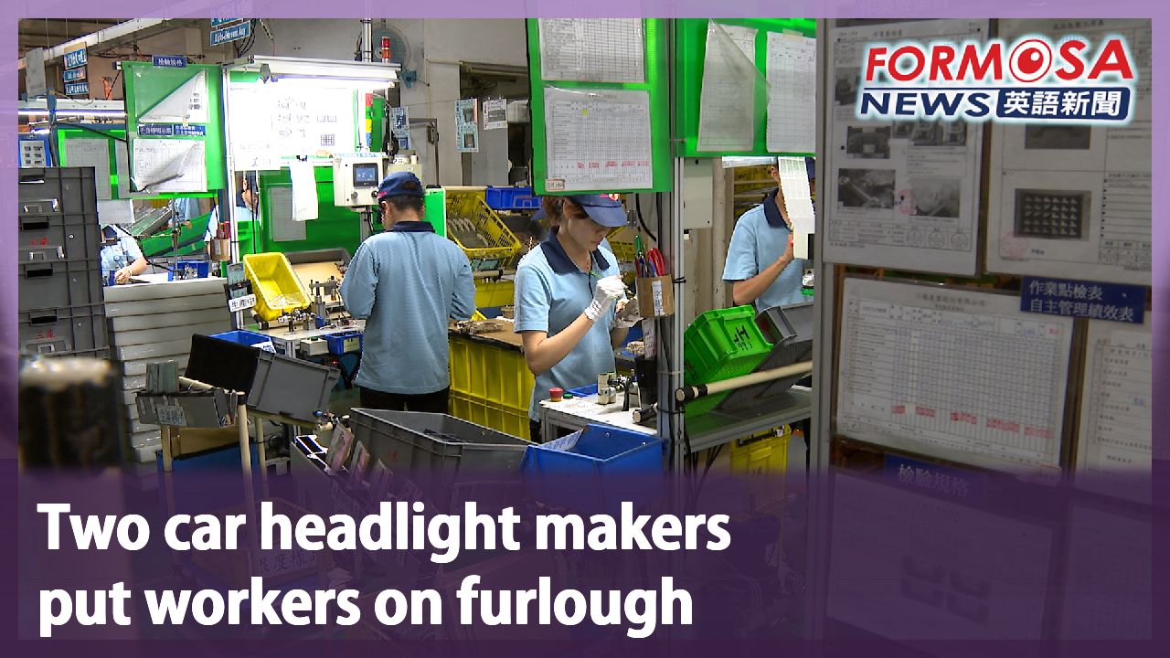
Passengers question streamlined MRT display as potentially confusing
Passengers question streamlined MRT display as potentially confusing
2025-08-18
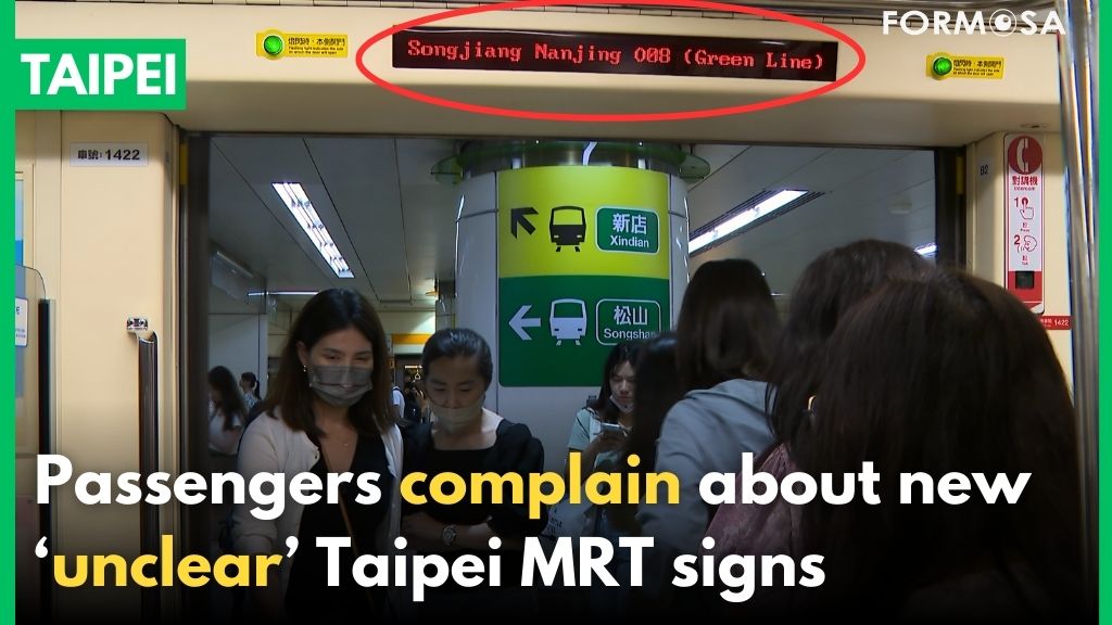
The marquee display boards on the Taipei MRT have often been a target of criticism for showing too much text, making it easy for passengers to miss their stop. The MRT operator recently made a slight change to the display, but now passengers are saying it might be too simplified. For instance, the “Xindian Line” is now just the “Green Line.” Critics say it misses the point, and now international travelers might get confused.
Before the train arrives at the station, information in Chinese and English scrolls by on the electronic display boards above the doors. For people immersed in their phones or listening to music, it’s hard to know the station at a glance. Especially when it’s crowded, it’s hard to see the signs inside the station. The situation has led to many complaints that it’s easy to miss your stop.
Passenger
Whenever I look up, it’s showing other information. I looked for a while, because I was waiting for the station name.
Passenger
No one will look at the information. You can say all you want, but what I need is the essential info. When it’s essential, I want to see it right away.
Kao Tzu-han
FTV reporter
The newly redesigned display is being trialed along the Orange Line, featuring shorter messages. But for transfer information, it now just shows the color of the line. Passengers worry it might be confusing.
Transfer information on the old display features the full name of the line, as well as some courtesy words, totaling 13 characters in all. The new message is much shorter, showing only the name of the stop with the color of the transfer line. Although it’s much simpler, passengers are worried that just saying the color might be confusing.
Passenger
For example, at this station we get a lot of travelers from Japan or other places who might not know how to make the transfer.
Passenger
When travelers come here for the first time, they navigate from their phone or online. So of course it won’t be very clear unless someone shows them.
Passenger
Now there are maps everywhere. It’s very convenient. No matter the line, there are maps to look at.
The MRT said it will collect public feedback during the trial period for the simplified transfer message, and continue to make adjustments before deciding whether to roll it out system-wide.
For more Taiwan news, tune in:
Mon to Fri at 9:30 pm on Channel 152
Tue to Sat at 1 am on Channel 53
#Taipei #MRT #TaipeiMRT #displayboard #travel #commute #publicopinion #traintransfer #tourists
北捷"到站顯示內容"太精簡 網批"搞錯重點"恐誤導旅客
2025-08-18
台北捷運車廂跑馬燈,常被乘客批評內容過長、宣導文字過多,讓乘客經常要下車時卻看不到站名,近期北捷悄悄改善,卻又過於簡化,像是新店線、改成綠線,讓網友們再批根本搞錯重點,可能造成外國旅客的困擾。
台北捷運列車進站之前,頭頂顯示器上例行宣導文字,中英文落落長,加上現代人低頭滑手機或戴耳機通勤,一抬頭卻不知這裡是哪裡。人擠人的時候月台標示也看不清楚,就有旅客抱怨顯示器無法一看即知在哪站,容易不小心忘記下車。
[[乘客]]
“我抬頭看都是在宣導那個東西。我看很久啊,因為我就等不到(站名)。”
[[乘客]]
“宣導的東西不會有人看,就是你宣導。但我要的是必要的資訊,我要必要的資訊,我要現在就看到這些資訊。”
[[民視記者 高子涵]]
“北捷新版跑馬燈在中和新蘆線試辦,宣導文字不再冗長。不過轉乘路線使用顏色簡稱,有民眾擔心看了一頭霧水。”
實際比一比舊版的跑馬燈轉站資訊,轉乘路線全文字顯示,加上客氣的禮貌用語,算一算13個字起跳;而新版跑馬燈轉站資訊篇幅大幅縮短,只有站名加上轉乘路線的顏色簡稱,儘管簡潔有力。但網友就質疑,只用顏色簡稱容易混淆。
[[乘客]]
“比方說以我們這站來說其實會有很多可能像日本人、觀光客那他可能不知道怎麼去轉乘路線。”
[[乘客]]
“(外國人)他們第一次來而且是從手機上、網路上看的,所以當然就會比較不清楚,除非有人帶。”
[[乘客]]
“現在都有地圖可以看啊很方便,不管它是什麼線,有地圖可以看就是很方便。”
北捷表示現階段試辦到站顯示器內容精簡,北捷也會蒐集各方意見,持續調整優化,後續將評估是否拓展至其他路線。
更多新聞內容,請鎖定:
民視台灣台(152頻道)週一至週五晚上9:30
民視新聞台(53頻道)週二至週六凌晨1:00
Related News