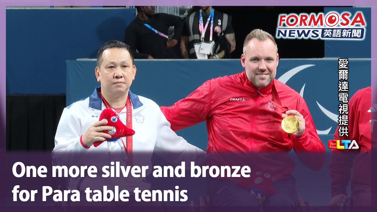
Uproar over National Day visuals that lean heavily on ROC aesthetics
Uproar over National Day visuals that lean heavily on ROC aesthetics
2024-09-04
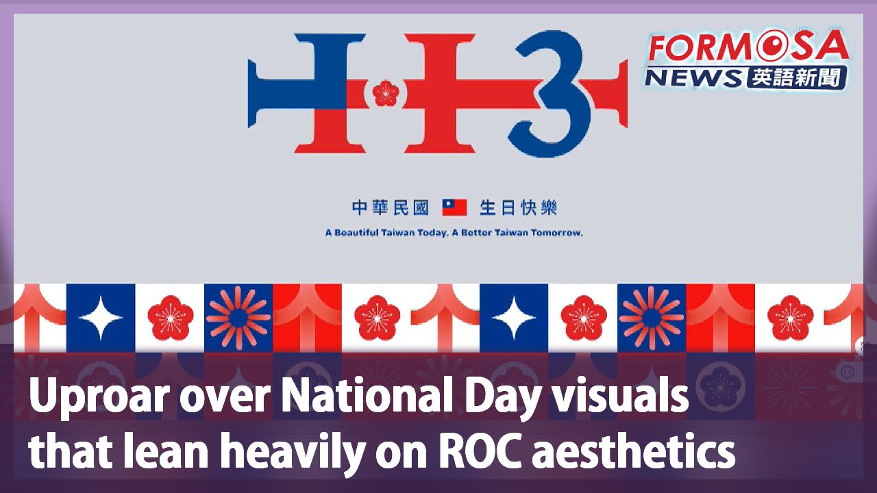
This year’s National Day visuals have been unveiled, and they have raised quite an uproar. The designs are a sharp departure from previous years and they lean heavily on nationalistic elements. The visuals are red and blue and feature a plum flower emblem, which according to a professional designer looks outdated. The logo was picked by Legislative Speaker Han Kuo-yu, and organizers say its designer was a young Taiwanese creator who wants to remain anonymous.
This year’s National Day website looks like this: red, blue and white, with the national plum blossom square and center. The nationalistic design hand-picked by the team headed by Legislative Speaker Han Kuo-yu has not pleased this professional designer.
Aaron Yin
Former Kaohsiung Culture Affairs head
Beauty is in the eye of the beholder. But ugliness unites us all. When I saw the design, I immediately thought of Han Kuo-yu, because the six tips of the logo look like the bases of wine glasses.
Aaron Yin, who previously served as culture chief in Kaohsiung says the design appears to be alcohol-inspired, adding that the logo seems to form an H that could be interpreted as Han’s initial. Some have also pointed out that the design looks similar to merch launched by political satire online news channel Eye Central Television. Usually, the designer of the visuals is unveiled with the designs. But this year, organizers have said the logo was created by a young designer who wants to remain anonymous. Critics have joked that perhaps the designer doesn’t want their name associated with the R.O.C.-style aesthetic many find tacky.
Lee Yen-hsiu
Lawmaker (KMT)
I would give this year’s visuals 90 points out of 100. A few people are criticizing the design as having an R.O.C. aesthetic. We respect their opinion.
Aaron Yin
Former Kaohsiung Culture Affairs head
Designing something at the national level is an honor for any designer. Doing so anonymously is extremely rare.
And it’s not just the visuals under fire. The event’s official website has been found to contain coding notes in simplified Chinese characters, giving rise to theories that both site and visuals were outsourced to a team across the strait, which could be why no creators have been named. Organizers say the site was built entirely by a Taiwanese team, with no Chinese workers involved. They say the contract stipulated a Chinese-language website template, which is why simplified Chinese can be found in the coding.
Lai Jui-lung
Lawmaker (DPP)
It got everyone worrying… Are we going back to the old ways? Are we letting Chinese elements in?
Han’s first year as head of the National Day celebrations is giving rise to much debate.
For more Taiwan news, tune in:
Sun to Fri at 9:30 pm on Channel 152
Tue to Sat at 1 am on Channel 53
國慶網站"簡體字" 慶籌會緊急澄清:台灣在地廠商製作
2024-09-04
今年的國慶主視覺,以紅、藍、梅花為主,呈現雙十意象,是立法院長韓國瑜親自圈選,卻挨批華國美學又回來了!前高雄市文化局長尹立就酸,看起來像是好幾個紅酒杯,美學設計非常復古,不只主視覺受討論,網站更被發現,程式原始碼出現簡體字,難不成是找中國團隊設計?籌委會趕緊澄清。
打開國慶網站,今年的主視覺,以紅、藍、白、梅花為主,呈現雙十意象,韓國瑜親自圈選的設計,看在專業人士眼裡,不以為然。
[[前高雄市文化局長 尹立]]
“當然美感見仁見智,但醜感大家有志一同,看到這個設計的時候,我反而也直接跟韓國瑜的形象,勾串在一起,因為它的六個角落非常像紅酒酒杯的杯腳”
前高雄市文化局長尹立,大酸主視覺看起來像是紅酒杯!有人覺得也像韓國瑜的H,甚至有人拿出眼球中央電視台2019的活動設計,笑說撞臉了!而且過去主視覺設計師都會公布,今年卻只透露,是年輕設計師"匿名"支持國慶,也被笑是不是不想承認自己設計了"華國美學"
[[立委(國) 李彥秀]]
“我給予這次的主視覺,90分的分數,還是有少數人用華國美學,酸言酸語,我們只能尊重”
[[前高雄市文化局長 尹立]]
“我想做一個國家級的設計,對我們設計師來講,這是光宗耀祖的事,用匿名的方式,這也是非常非常罕見”
不只主視覺受到討論,國慶網站還被發現,程式原始碼的註解出現"簡體字",像是創建、替換等等,遭質疑該不會網站跟主視覺設計,都外包給中國團隊?才會不敢公布。籌委會趕緊澄清,官網全部是國人擔當製作,沒有中國人士,招標契約也有明訂,廠商在網站設計時,模型採用中文語言模式,才會夾雜簡體字。
[[立委(民) 賴瑞隆]]
“讓大家擔憂是不是走回了回頭路,是不是讓中國的元素增加”
立委砲聲隆隆,韓國瑜擔任慶籌會主委的第一張成績單,看來還有待觀察。
更多新聞內容,請鎖定:
民視台灣台(152頻道)週日至週五晚上9:30
民視新聞台(53頻道)週二至週六凌晨1:00
Related News